
Today we’re excited to introduce to you our new branding. Along with that, we’re unveiling an all-new website that captures the essence of how our technology delivers real-life impact.
Our mission at Bluedot is to enhance the power of place, with best-in-class location technology that makes life convenient and memorable. As we draw inspiration from the enterprise brands we work with, such as Dunkin’, McDonald’s and Transurban, we set out to transform our logo from the expected to the surprisingly delightful.
We also wanted to convey how distinct our solutions are compared to others. Especially, our ability to truly deliver accuracy and real-time data that brands can tap into to serve their end customers better. Video Player
In our quest to pay homage to our beginnings while expressing the future of location technology, our rebrand continues to be a representation of Bluedot’s strongest foundational element: unlocking the power of place.
Here’s a quick look at how we developed our new logo and brand expression.
Differentiation
Bluedot – you’ve heard of us, right? Or was that the music festival, human resources company, infectious disease predictor? No, maybe it was the furniture store or Carl Sagan’s “Pale Blue Dot” monologue from Cosmos.
The truth is, there are a lot of blue dots in the world, almost all of which represent themselves with a logo containing – you guessed it – a blue circle. As we discovered while working with our design team, having an easily understood symbol coupled with a clean, humanistic font are actually great aspects to have in a logo. But, what made our dot stand out in a sea of blue?
If our geofencing platform is completely distinctive, why isn’t our branding?
We wanted to maintain a clean, humanist, almost timeless feel with our font while also embracing a more energetic, and unforgettable color pallet. One of our biggest challenges – how we evoke this concept of location – became a strength: rethinking the pin drop symbol.
The Pin Drop
Our pin drop symbol has served us well. While universally understood, it wasn’t quite ownable. It’s clear we’re not a furniture store. However, like our muted blue and grey color pallet, our pin drop symbol did not reflect the energy we felt at the company, delivering “high-impact experiences,” “unrivaled accuracy,” and “the power of place.”
Before we started this project, I would have told you the pin drop symbol originated from Windows ‘95 clipart that symbolized a point on a digital map. However, the real origin of the pin drop dates back to the early 20th century with the art of manual map labeling called cartopinography.
In cartopinography, different colored and sized beads were pinned to a map to indicate a series of data points for that specific location. Then, a colored celluloid ring was slipped over the head of the pin to denote the meaning or value of all those data points together in that place.
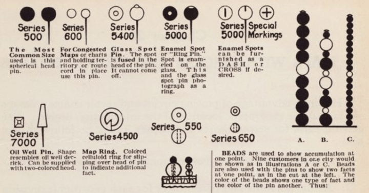
Like stars aligning, we immediately fell in love with the celluloid ring concept as Bluedot shares this unique ability to assign power to place: a perfect pairing between cartopinography series 4500 to modern day Bluedot.

By reinvigorating and re-imagining this analog symbol, we are underscoring the idea that we as people have been using our collective experiences to designate places as more than geography for centuries.
Bringing It All Together

Bluedot’s new logo, rendered in a vibrant purple serves as a strong and confident “hello” to the world and is easily identified at a glance.
The sharp points of our font emphasize our tech’s precision. The slanted tips of the text align perfectly with the cartopinography symbol and the italicized font indicate forward motion. This not only reflects our tech is fast and innovative, but also that our clients help people on-the-go.

Underneath this fresh new look is our enterprise-ready geofencing platform without trade-offs. We’re able to provide instant, accurate location detection without draining the battery or continuous tracking. Our first-party data is scalable without needing hardware, and most importantly, personalized without compromising on privacy.
We’re proud to share this bold new look of Bluedot that best reflects the remarkable experiences our technology delivers. And we’re looking forward to helping more brands unlock the power of place.

